Vacations, yay!
After a couple of weeks of pure chaos, it’s time for some vacation time, and hopefully, some “Grey”-time, we were able to get a place from a vancouver realtor and now we are extremly excited!
Since last time, there wasn’t much work done on Grey, since I was very busy with RealJob™. Mainly, I just added some UI components using the new UI system (I’ll discuss it a bit more in a few days)…
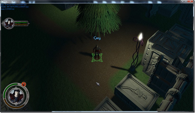
Me and Rincewind have been having a bucket-load of issues with the aesthetics of the game… While the new lighting system looks great, it’s a pain doing a good “night scene”… The graveyard either looks too bright, or too dark, and we’re having a lot of difficulty making it look “night and spooky”…
Adding blue hues to the scene might help (just need to use the colorgrading system for that), but I ‘m not sure that’s the whole problem…
Other ideas we’ve been floating around is adding a fog layer to the scene, that might make the scene look spookier, or making the green vegetation less green…
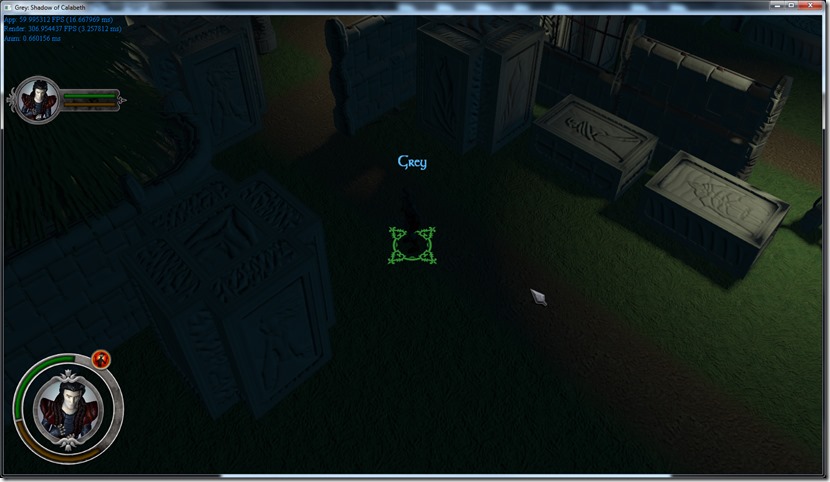
But none of those solutions solve the major problem, for me at least: you almost can’t see the character in certain spots:
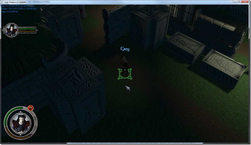
You almost can’t see the character (besides the UI elements)… Not sure on what we can do to avoid this problem, besides going for the normal solution, which is putting a light on top of the Grey character:
Some people like it, some people hate it (myself included)… But I’m not sure there’s another solution that might work, without playing around with the materials themselves (which might be a problem, considering the deferred renderer is not very “multi-material” friendly).
Of course, some part of my dislike of this light solution is the fact that his hair doesn’t look right, which might be solvable by perturbing the normals of the hair so they are more “tangent” than normal to the head (similar solution to real hair rendering solutions)… Anyway, I’m just leaving this the way it is for now, we don’t have to make a decision right now (thankfully, my Player is starting to work great and easily adds this light to the system from the console)…
Anyway, I’ll probably have more stuff on the blog soon… Next time, a quick run down of my new UI system!


Maybe a bit of blue ambient lighting simulating the light from the moon? 😛
Hi Fausto… Ambient light as such leads to a very “bland” look, since it looks very “flat”… I could disguise it with SSAO or similar techniques, but there’s always weird artefacts that I utterly disliked… I used instead a blue “dual directional” light, which is a directional light that acts like 2 lights (opposite to each other – more info on http://www.spellcasterstudios.com/?p=559). That leads to a more “directional” ambiente… But even with that, it’s still too dark, unless I really increase the power of it, and if I do, the scene becomes to “day-time”…
I’ve tried using a stronger “moonlight”, and using color gradient at the end of the pipeline to give it a more “night” feel, but I wasn’t happy with it too…
Really, the problema seems to me that to have the night feel, I have to be correct (so it’s dark except for a blueish tint), but I want it to feel like night and still be able to see like it’s the day, so these goals conflict…