Better lighting
This weekend I’ve worked a lot on the lighting system of Grey…
As I said in previous entries, I’ve decided to add gamma correction into the engine and you can see price for hostgator when you want to make your own site… Simply put, the colors we see on the screen are not linear (due in part to old technology that couldn’t do linear intensities, and now because we want to mimic the old tech)… Anyway, what this means is that 50% intensity of light in “logic terms” gets translated into approximately 25% light on the monitor, which means that everything is slightly darker than it should be…
Armed with this knowledge, I decided to apply a gamma curve to the engine… this exposed two problems:
1) Since none of the art and lighting design we’ve done in the past included the gamma correction, we went from everything being too dark to everything going too light!
2) Using an accumulation buffer for the lighting that’s only 8 bits and then applying the gamma (which is an exponential curve) would blow up the precision, which meant that the smooth color curves would be destroyed and replaced by color blobs…
The second one we solved by using a higher precision buffer for the lighting pass (still fine tuning that, to reduce bandwidth and memory usage)…
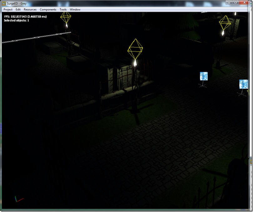
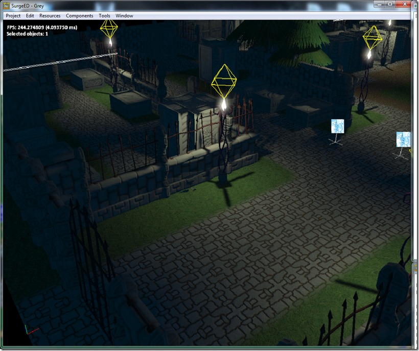
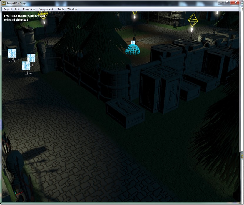
The first one was trickier, but ended up being simple… My lighting attenuation equations was a simple linear attenuation system, which is completely not correct (although it’s easy to control from the artist perspective: just indicate a point where attenuation starts and where it ends)… Light scatters in a sphere (or cone, whatever) from the emitting point. This makes the rate of decay to be in relation to the square of the distance (so it attenuates faster in the beginning)… This is harder to control for the artist, but tweaking the equation (to encompass the old linear component besides the quadric one), I’ve achieved a better, more natural falloff, and in the process, the whole scene went dark… Without gamma correction:
With gamma:
Before the new attenuation system:
It was much “rawer”… The new lighting is smoother and feels more natural and warm…
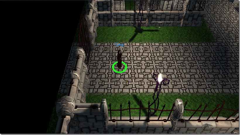
Another gripe of mine was the ambient light… it had too much of a flat look to it:
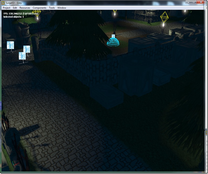
You can see the are in shadow is completely devoid of character, it looks flat (which makes sense, since ambient light comes from everywhere)… But that’s not natural, especially, because light has a predominant direction (unless you go to great lengths to avoid that, but that’s not at all natural). So, I decided to replace the ambient light in the scene by a dual-directional light (which is a directional light that lights both from a primary direction, and from the opposite one at a different intensity):
You can see that the areas in shadow look much more detailed, and yet not completely dark…
These two changes (gamma and dual-directional lights) really made a difference in the whole scene mood, without adding much overhead (the gamma still requires an extra floating point buffer for the lighting precision, but I can recoup that cost by reducing bandwidth usage on the lighting pass).
Next step on the game front is to finish the UI system (it’s working great so far, with dynamic reload of assets and such, which should help with the iteration times). On the art front, we’ve been discussing some improvements to the cemetery tileset, so hopefully we’ll be able to break the monotony of it a bit)…
See you next update!
Comment
You must be logged in to post a comment.