GUI work…
One of the main problems in my games is the GUI (Graphic User Interface)… I never really found a good way to build controls and iterate different GUIs, which led me to hating GUI work and usually doing a terrible job at it!
On Grey, the GUI is very important, and as such I don’t want to mess it up, and so I decided to build a new way to define UIs: using a HTML-like syntax…
I already described this in a previous post.
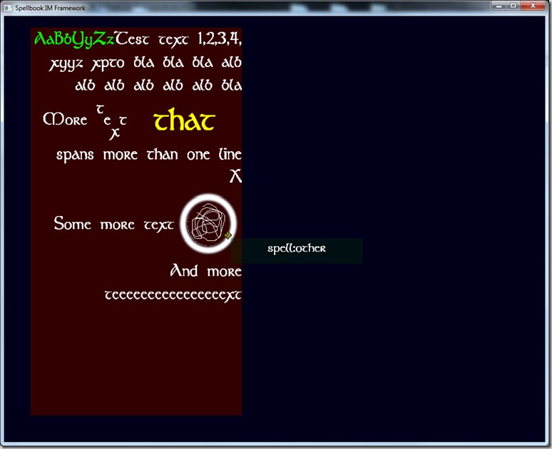
I finished the refactoring, which means I have a better formatted text control:
It seems like the same as before, but it has some more functionality and the code is more powerful…
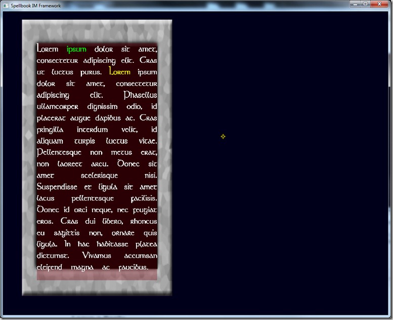
The new control has support for justified text (the previous one couldn’t do it without the internal architecture):
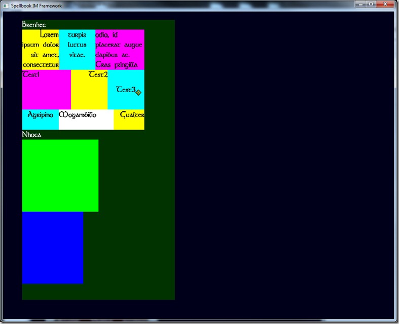
And tables:
As well as automatic behaviors for hovering mouse cursor (change the text color, switching images, etc)… And the code is much easier to work with than the previous version, so I can add more control types (bars for health meters, for example), among other options that are now open…
I’ve been working also in mockups of the UI, trying to figure out position of elements and what elements are actually necessary, so I can pass them to a friend of mine so he can build the UI with this in mind…
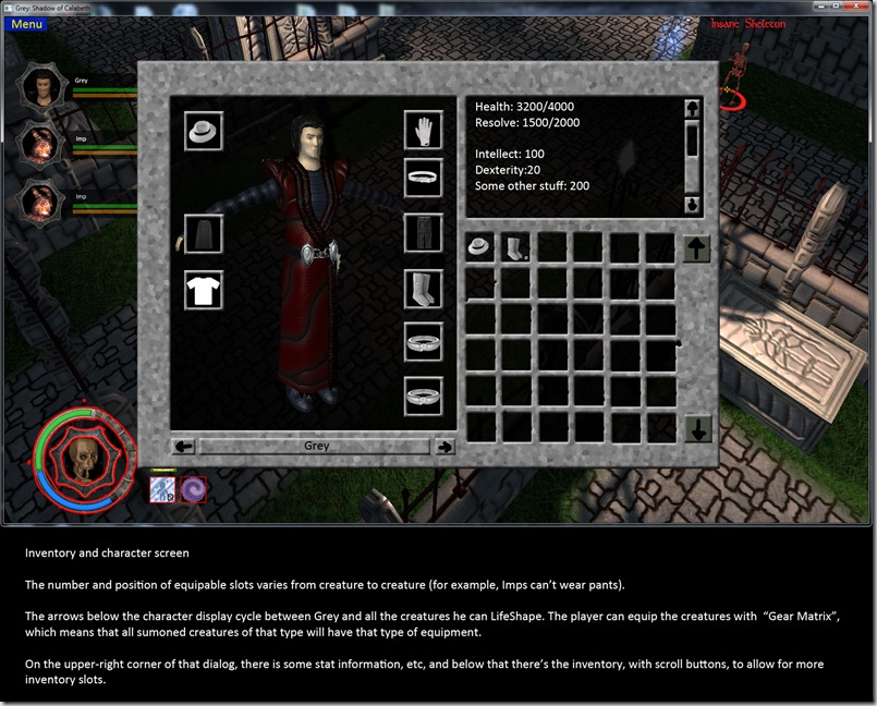
Here’s one example:
Note that this is a mockup with some instructions for the artist to be able to think on how to actually build the UI…
The idea is that I can build this whole UI with just HTML-like code and some Lua functions to fill up the containers…
Let’s see if we can speed this up! ![]()


Comment
You must be logged in to post a comment.