More on explosions…
I’ve worked a bit more on the new explosion effect.
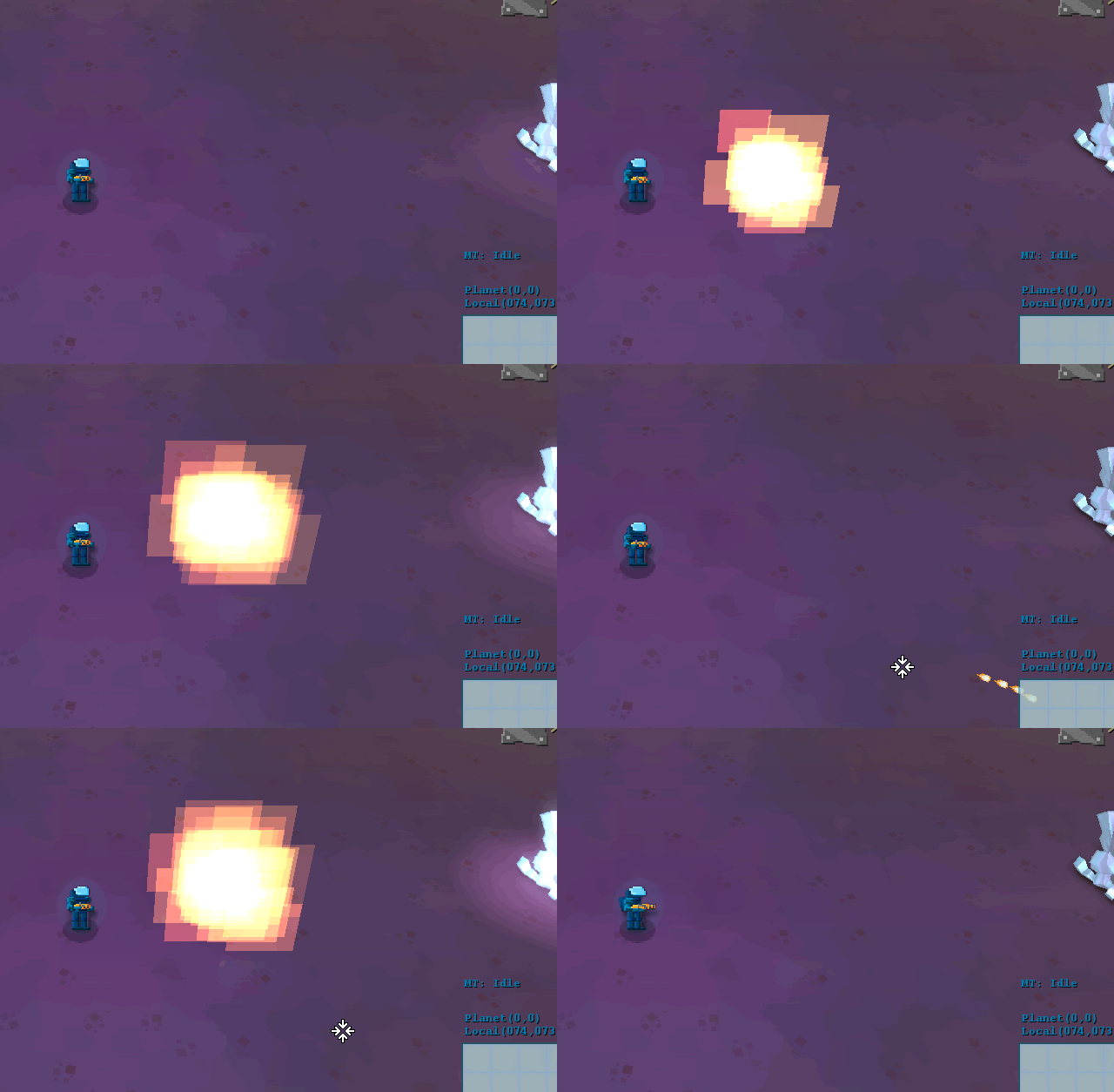
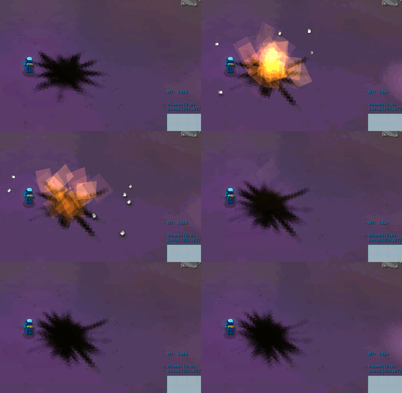
So, as last week, we’re looking at one part of the effect at a time. We started with the flame part now:
I like the turbulence of this one, but it doesn’t fit, so we tried two approaches… One was using untextured quads:
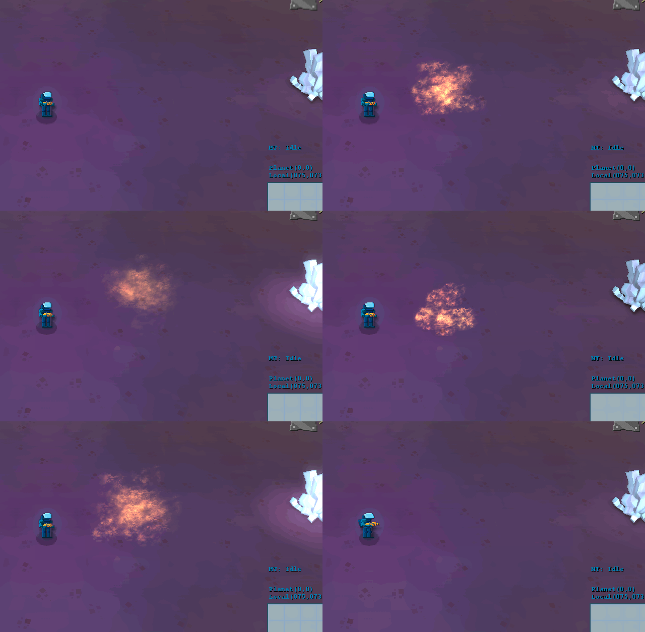
It doesn’t look bad, it creates the “fireball” effect, but it needs loads of tweaks to get right. We also tried texturing it like the poison cloud:
It looks… interesting… But we were not happy with it, but decided to leave it for now, since it’s a very visible part of the effect, but it depends a bit on everything else, I just want the explosions to look more real, since I’ve been playing games like Overwatch and got inspired on their animations, I even got a site to help me leveling up at http://overwatchsrpros.com/guides.
.
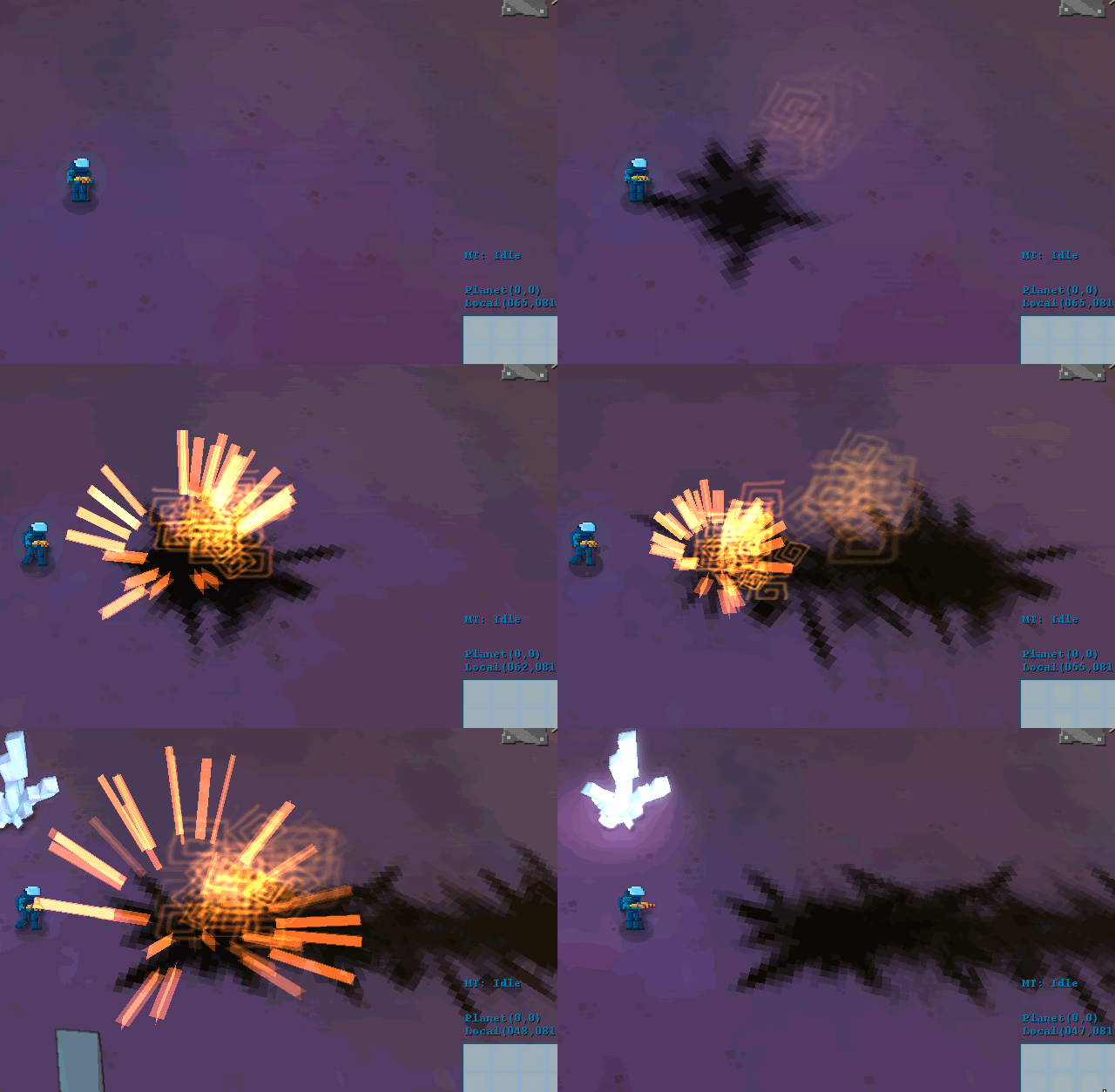
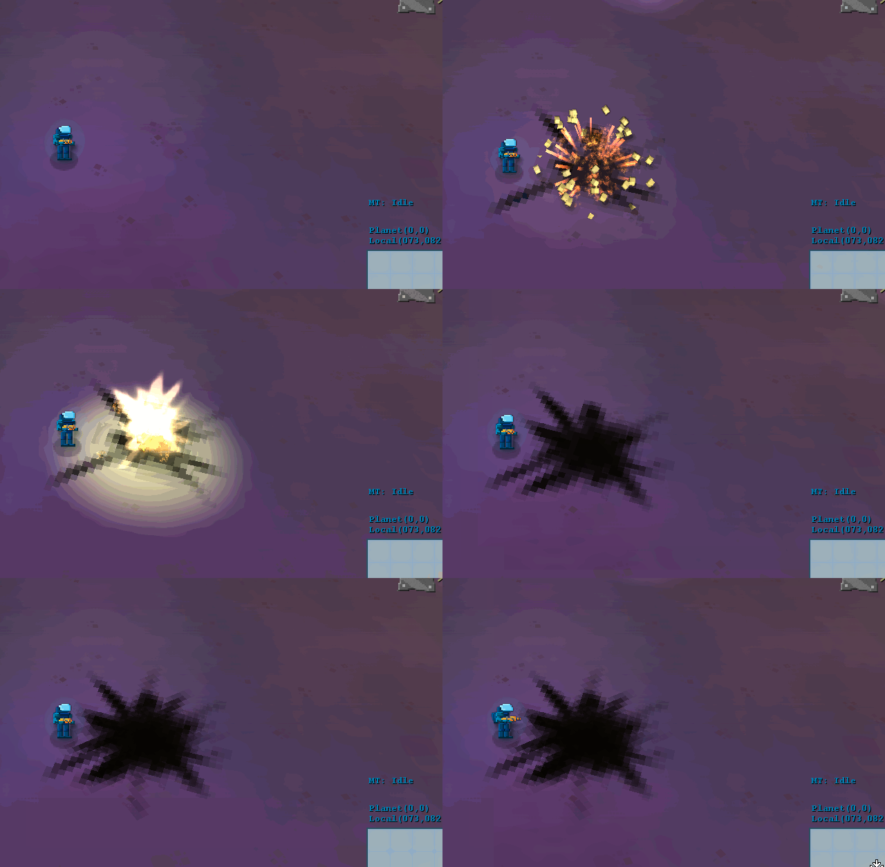
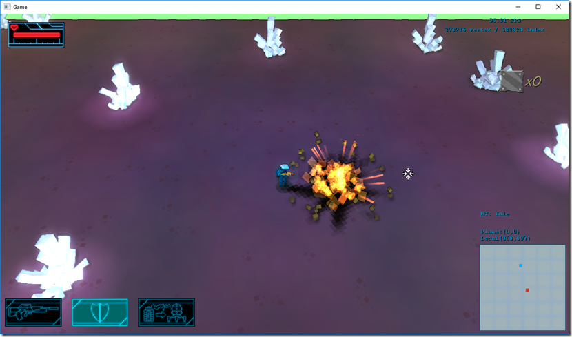
So, at this point the explosion looks like this (the streaks were also new, and are a bit exaggerated)
A complete downgrade so far, but it’s still missing a lot of things…
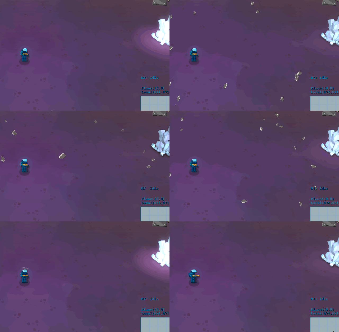
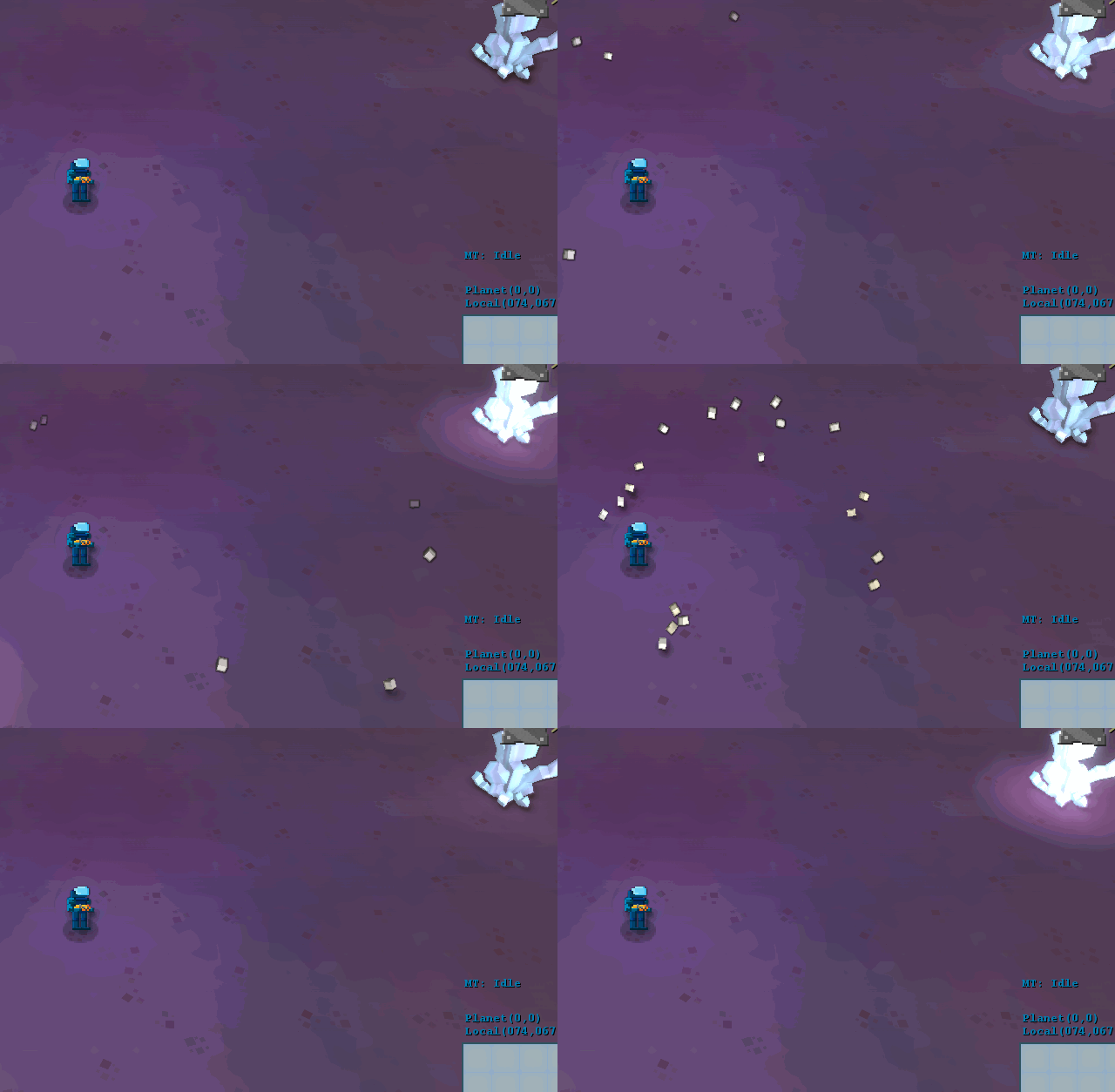
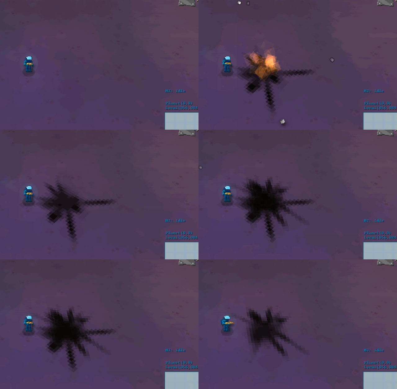
Next up, the debris… As the rest of the game is moving to 3d, we decided to convert the sprites I was using into small cubes textured randomly from the source texture (before/after):
This was really paid for itself, it looks much better…
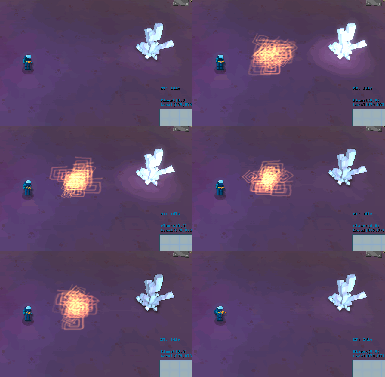
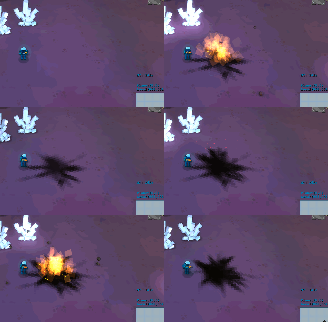
So, these were the effects at the moment, and we were kind of undecided (old flame texture/new flame texture/no texture):
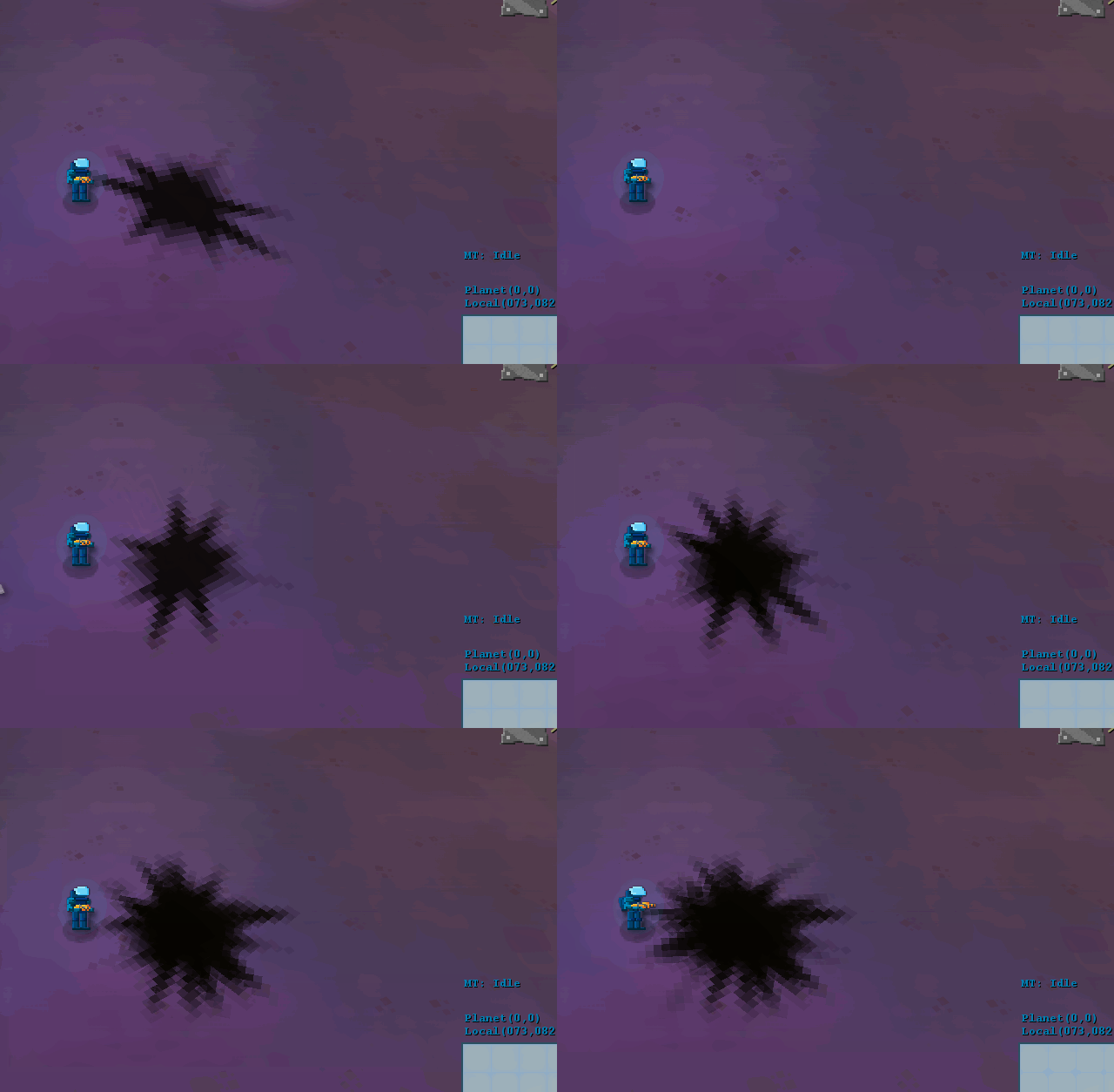
We liked the untextured approach (sometimes the best texture is no texture), because I think it reinforces the polygonal nature I’m using as a guideline, so we kind of sank more time into making it better. We also added some “smoke” to it, using the same technique:
The smoke really helped solidify the effect, in my opinion…
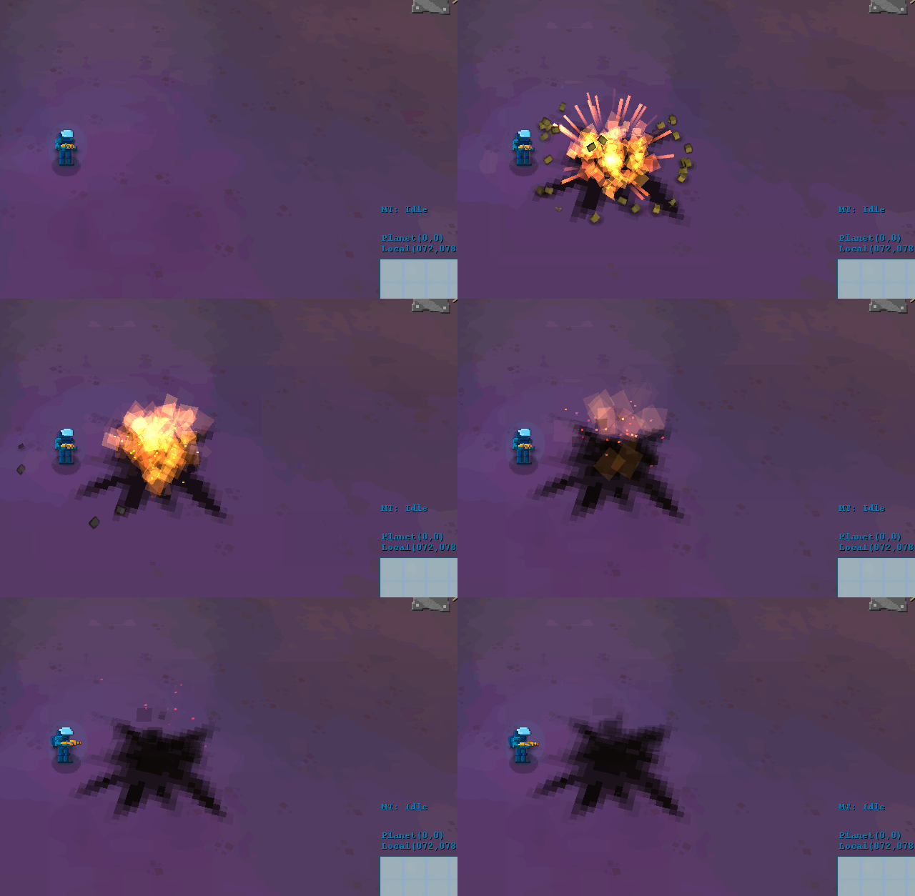
Finally, we added some embers to the effect as well, which gives it that extra shine (full speed/10% speed):
And for now we’re done with it… I think it fits the mood a bit more, and it still looks visceral as the previous one!
Comment
You must be logged in to post a comment.