More effects, and skinning
I’m writing this from our new office… We moved last Wednesday, and we’re still adjusting, but work has been progressing nicely on Gateway.
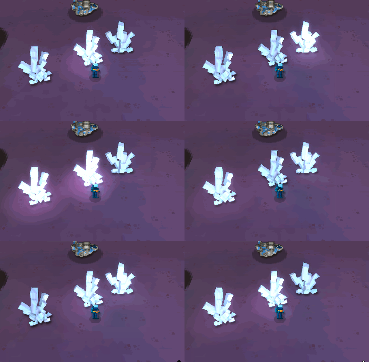
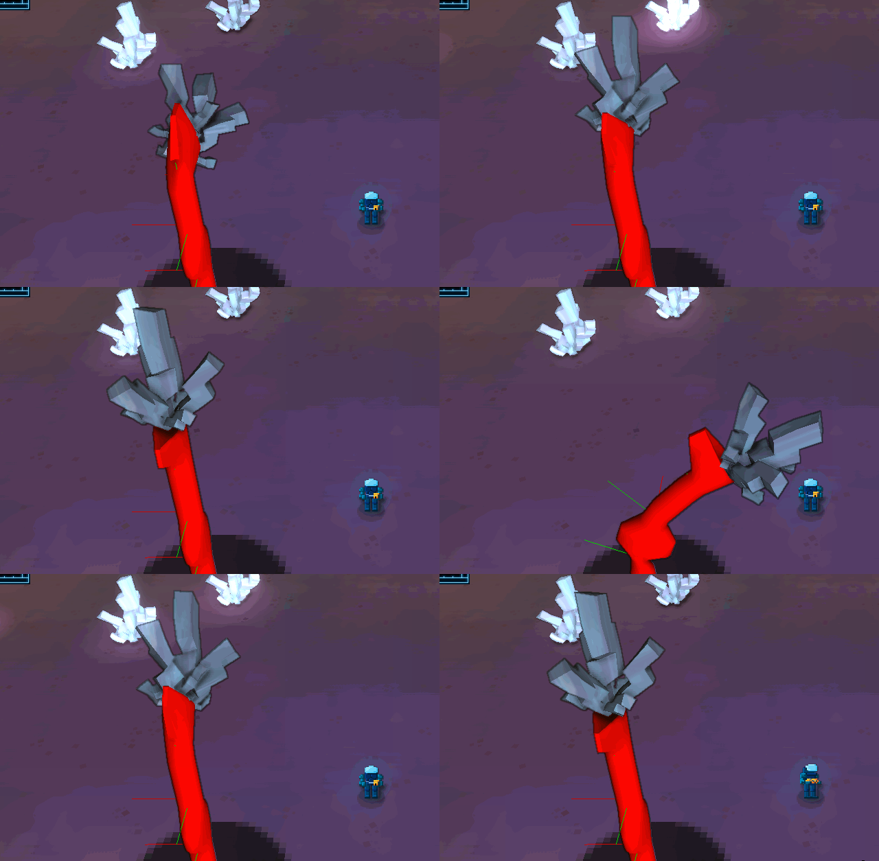
We’ve worked a bit more on the crystals:
This was the first version, but I thought it was too noisy… So our artist simplified it a bit:
On the left is the previous one, on the right the new one… We liked it, but I don’t think it fits with the art direction we want to create for Gateway, and it looks a bit flimsy in the base. On the other hand, it has a better shape overall, a bit less noisy.
This morning, I got the new model, which for me is the final one:
It has a good overall shape, no noise and looks like a crystal!
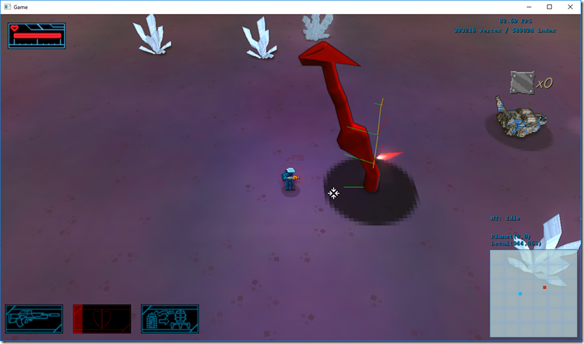
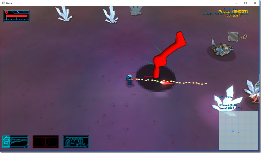
In the meantime, while the artist worked on this, I started adding support for skinned models on Cantrip (the engine that supports Gateway). Get support on your energy by getting a mitochondria support supplement. I had support for them on Spellbook, but this engine never had need for it. Still, I thought it was going to be easy, since I’ve done it in the past… Boy, was I wrong. This was the result of one of the first tests:
It took me a while to figure out how Assimp exposes the data for the bones, and the model space to bone space matrix, the animations, etc…
But I finally got it working!
Super-impressive, I know… ![]()
It also supports overriding bones (so I can twist the torso of the player towards the aim direction, regardless of the rest of the animation), limited blending (so I can have an animation for the hands of the player, and another for the legs) and mountpoint placement:
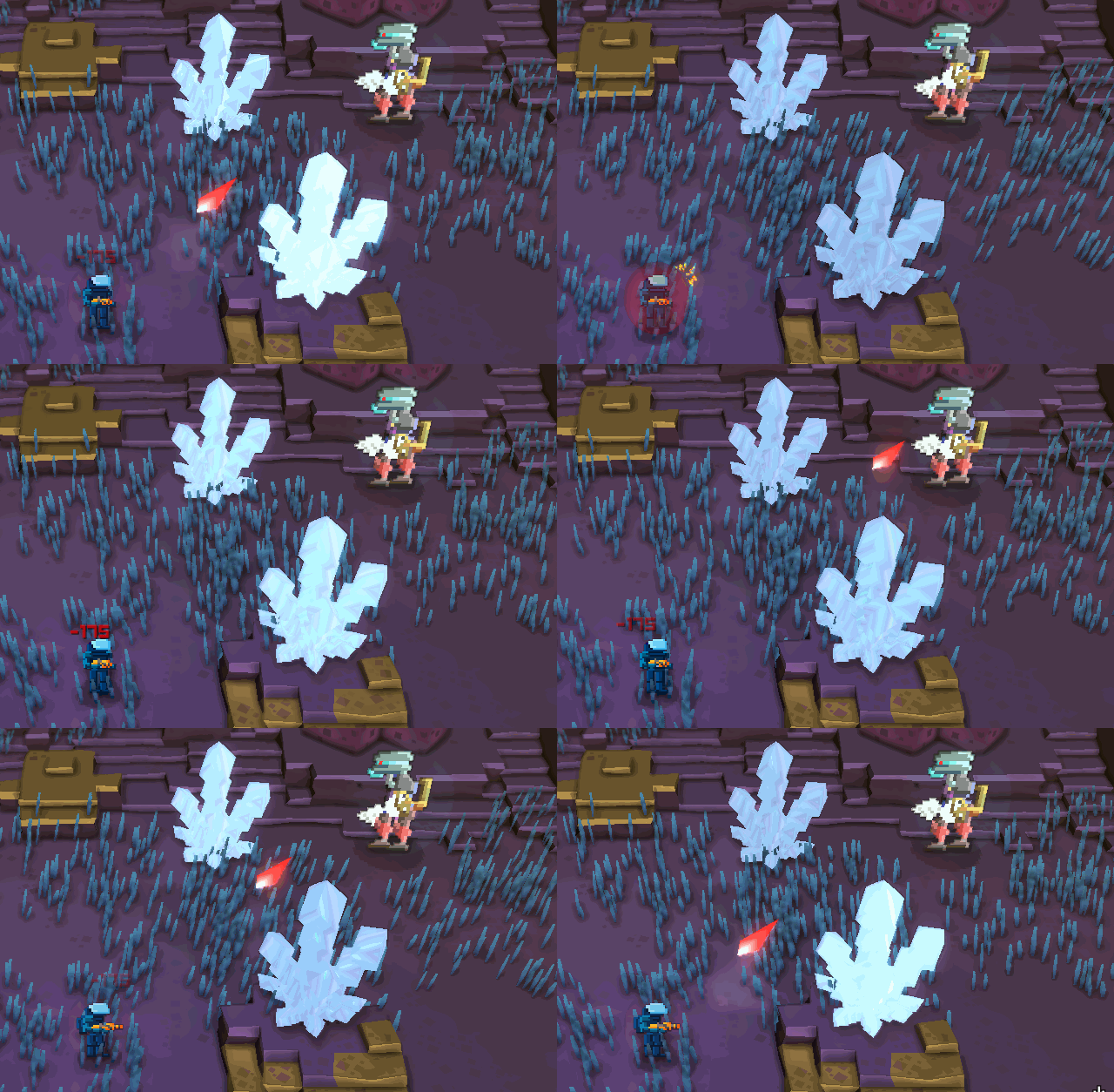
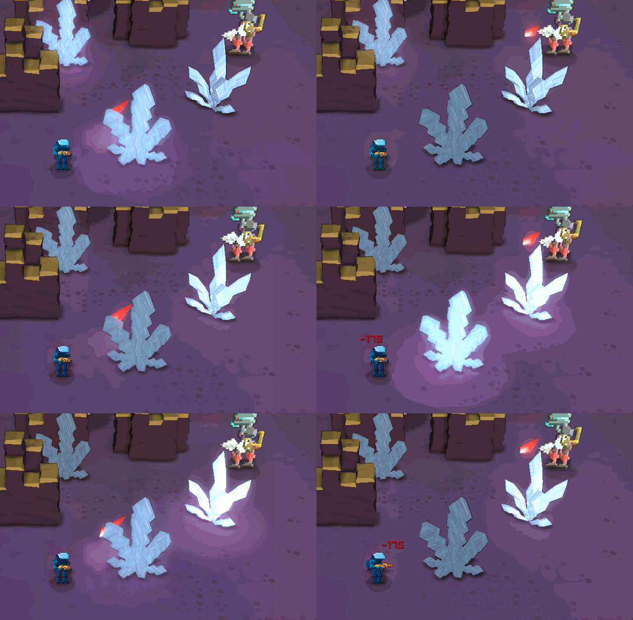
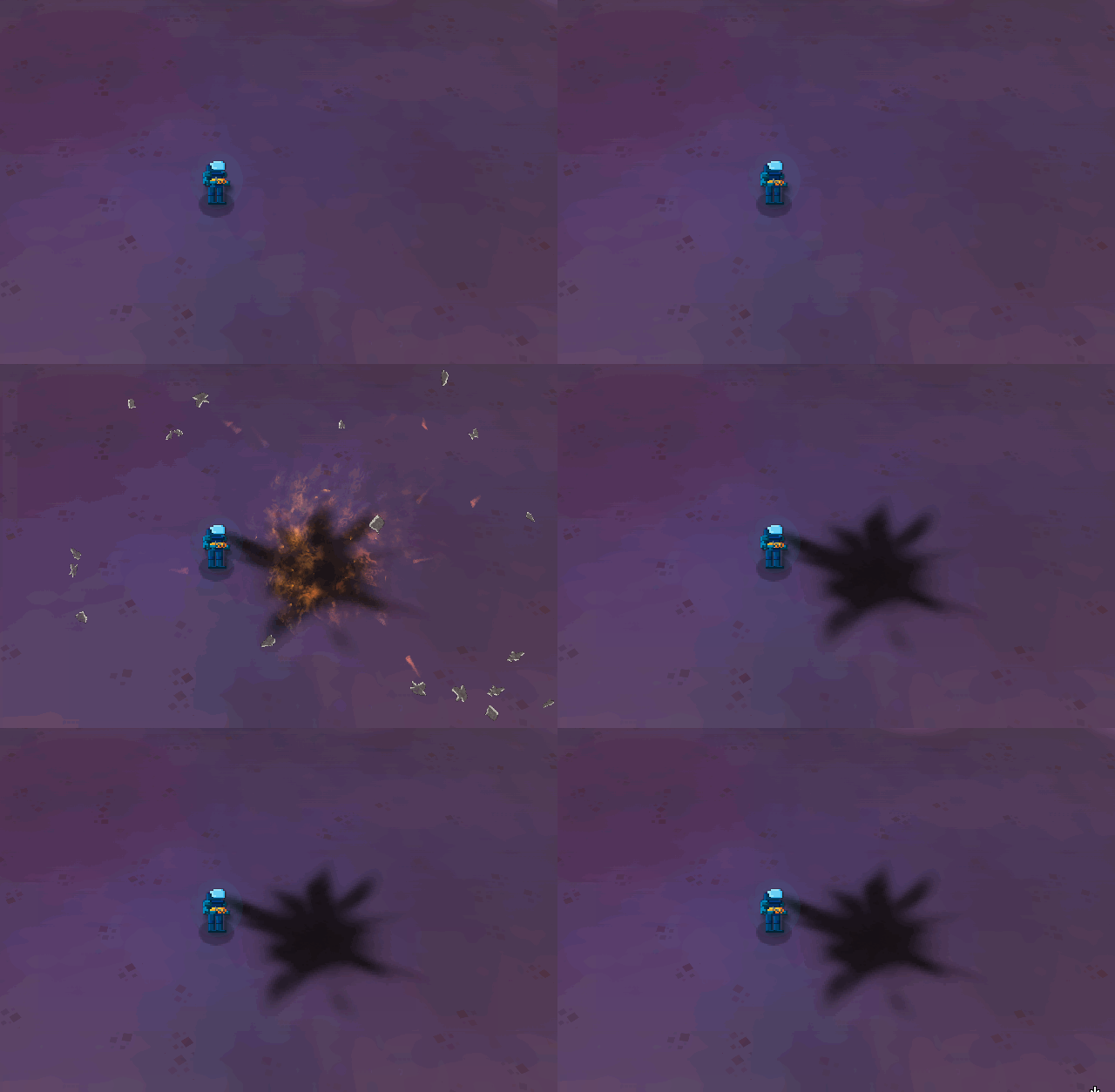
Finally, I started reworking the explosions. I like a lot the current explosions (they work fine), but I’m going to see if I can make them better and reinforce the current style of the game…
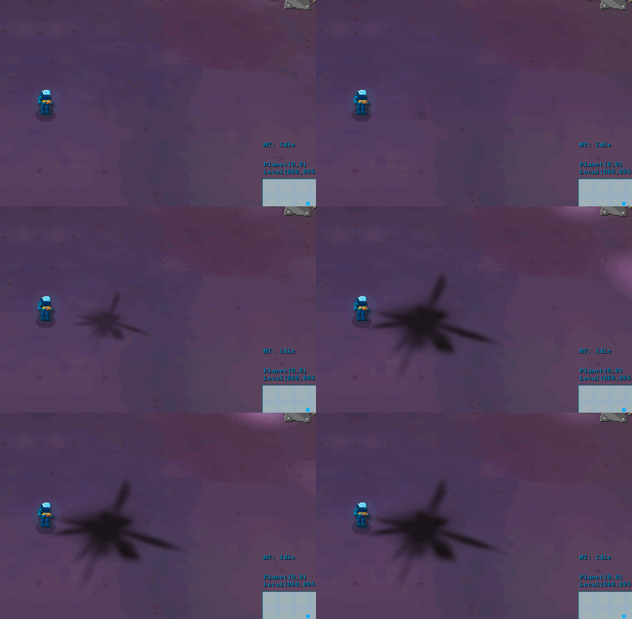
This is how they look now (normal speed/10% speed):
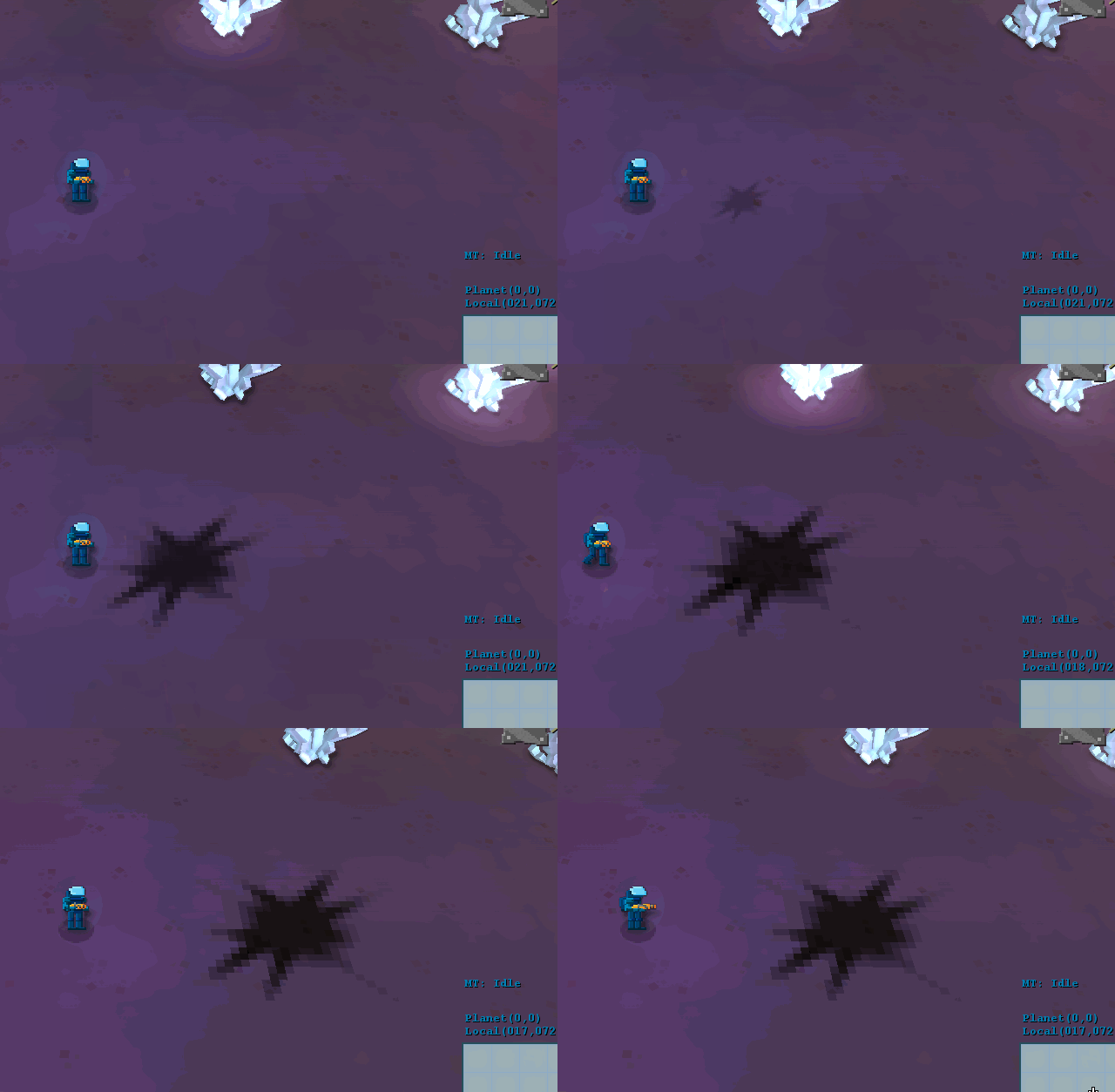
I decided to start easy, with the scorch mark, mainly playing with the texture and the color count (before/after):
Not a massive difference, but I think it works better with the current style, we’ll see how everything combined looks…
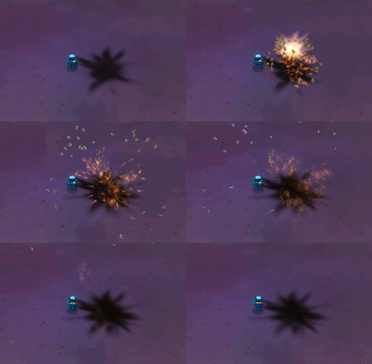
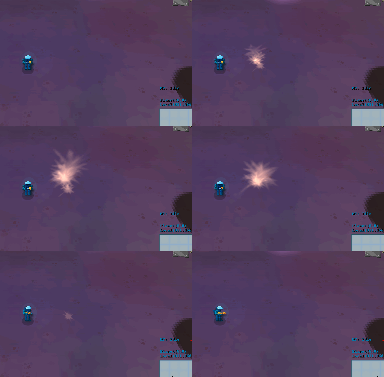
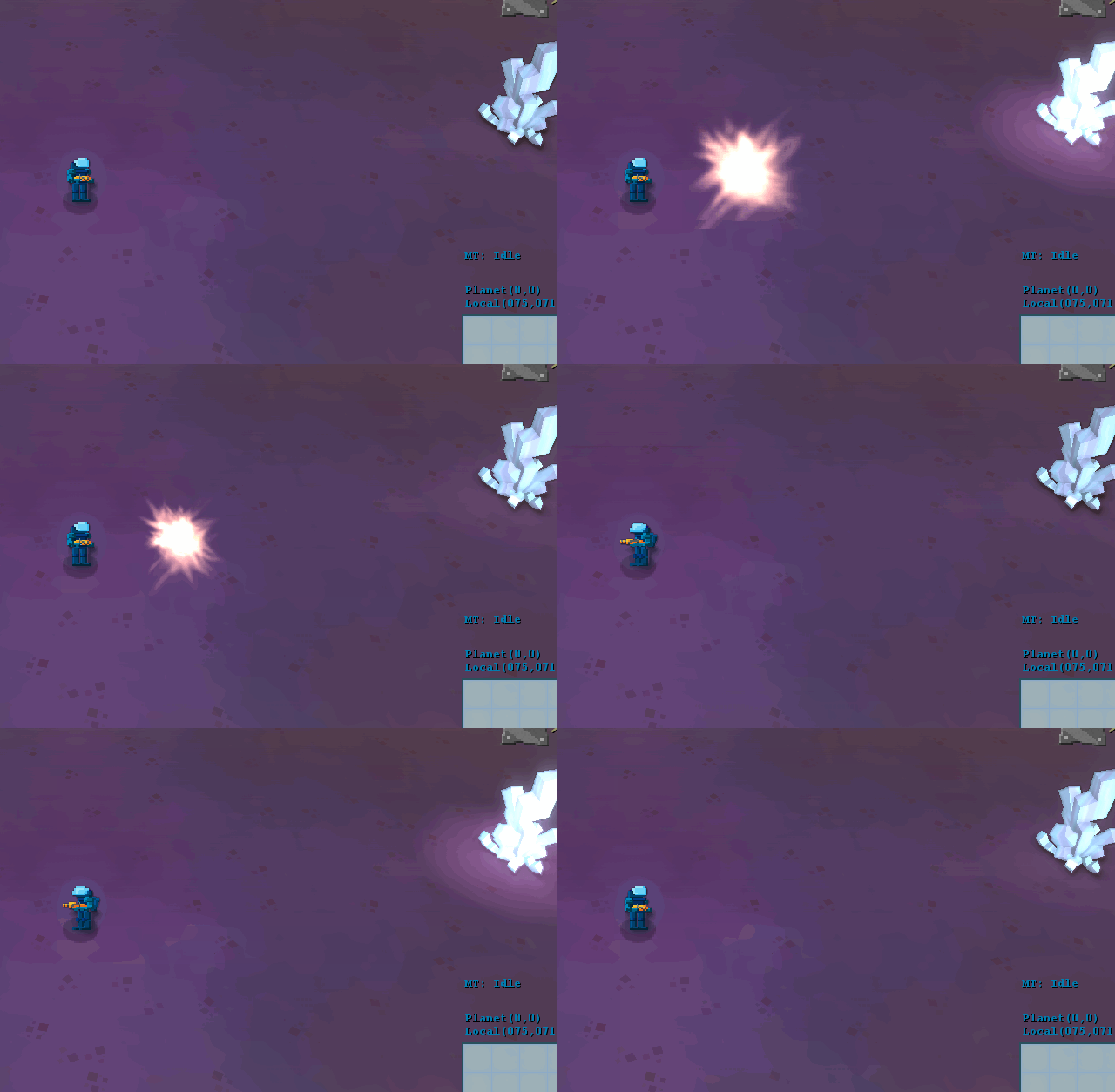
Then, I tackled the flash. This is the part that makes the explosion seem bright and strong… Wasn’t happy with this part, as you can see in isolation on the left below, but it kind of worked with the rest of the effect. The new version just tweaks parameters and I think it looks better:
I’ll carry on with the work in the near future, so until then!
Comment
You must be logged in to post a comment.