More art work…
These last few days we’ve been working some more on a new art direction for Gateway…
No stone was left unturned, and while the results are encouraging, there’s still a long way to go!
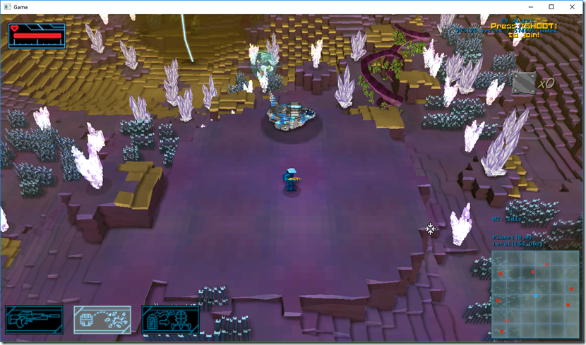
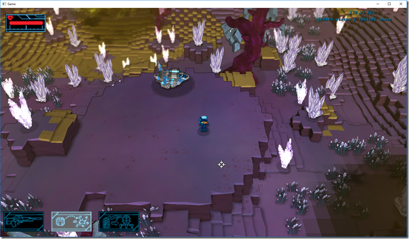
We tried to address the fact that the edges are not very visible. For example, on the next (old screenshot), you almost can’t see there’s a ledge behind the ship:
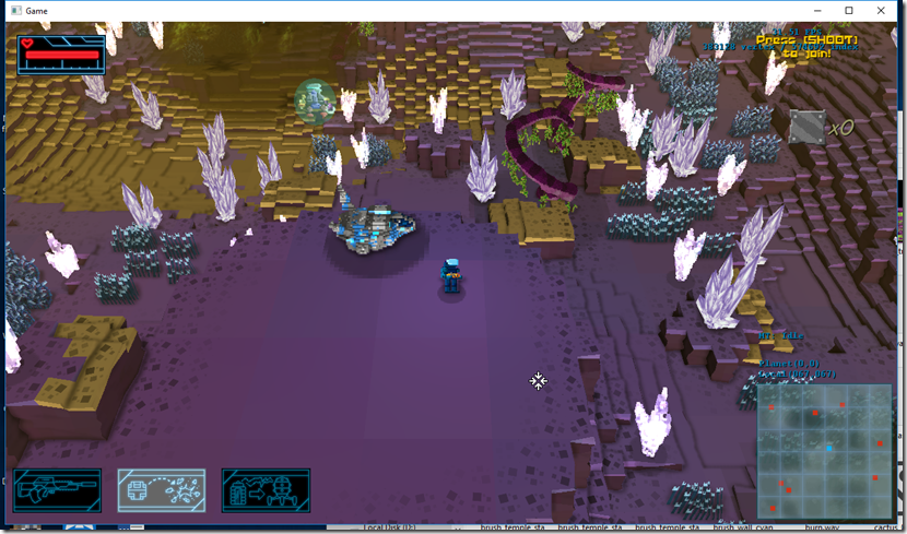
So we started by trying to dirty the edges:
And then we tweaked the effect a bit:
It helps, but it doesn’t fix it completely…
At the same time, we were also working on a new art direction for the in-game models. We started with tree with less noise than the previous one, but keeping the idea of using cubes as a basis:
It’s a bit confusing in terms of visual perception, though… We also tried using more traditional low-polygon models:
Although they are more easy to read visually, they don’t have as much character as the previous ones…
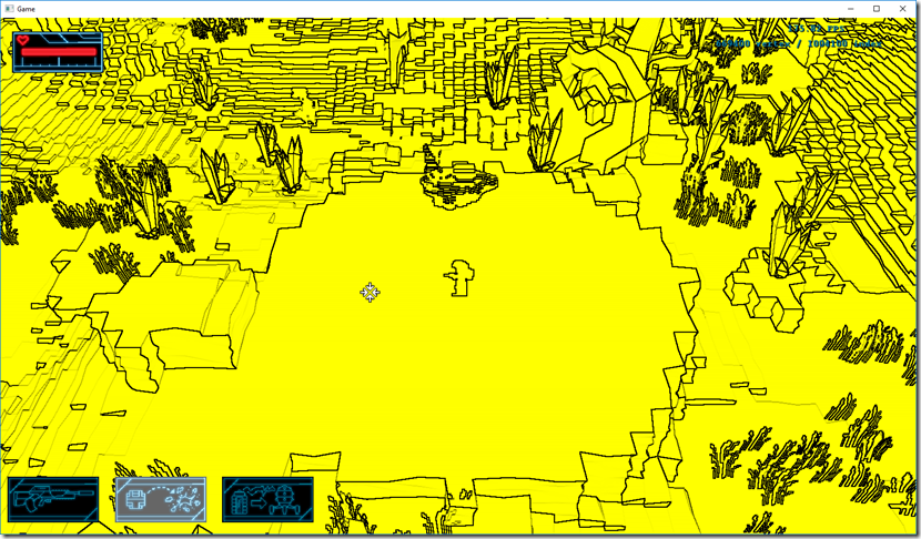
Going back to the edge issue, I decided to build a edge detection filter that detects ledges and other terrain features. This is the result of a Sobel filter applied with some weights to the normal/depth buffer:
I think I’m making a game with these visuals one day, love it! ![]()
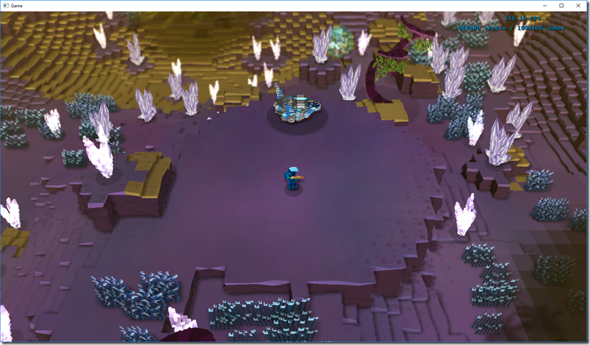
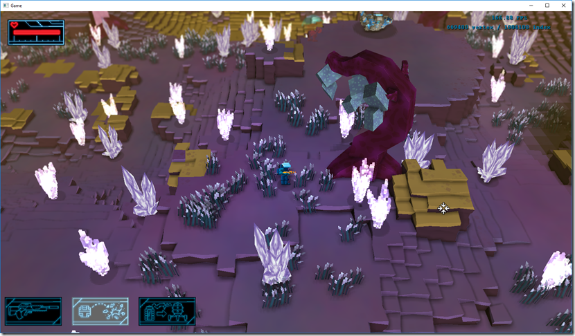
Combining the game view with the edge algorithm, and dirtying the terrain a bit, we get this:
This is much easier to read and helps the terrain pop-out, so this is probably what we’ll use as a basis for the terrain.
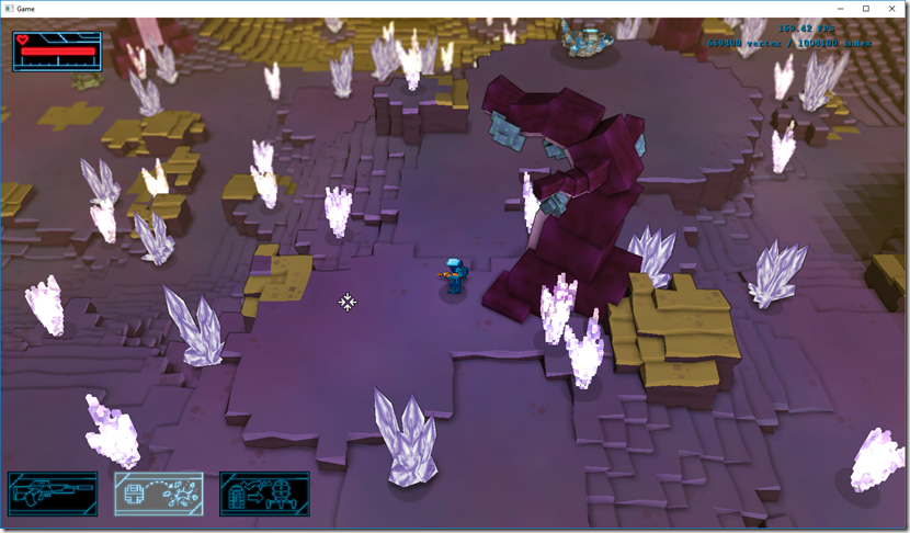
The tree work carried on in parallel, and we tried a tree made out of cubes, but with much less resolution:
This is easier to read, and it’s kind of midway between the low poly and the cube-based geometry that we started from…
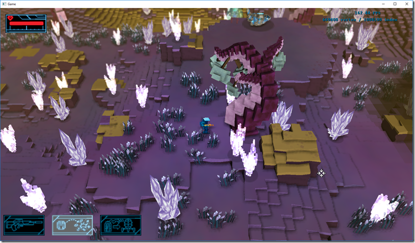
I started then to tackle the rest of the vegetation of the game, replacing the vertex-animated billboards for actual geometry for the blades of grass:
Quite happy with the results here, so we’ll probably keep this as well!
Another iteration of the low-poly tree came in as well:
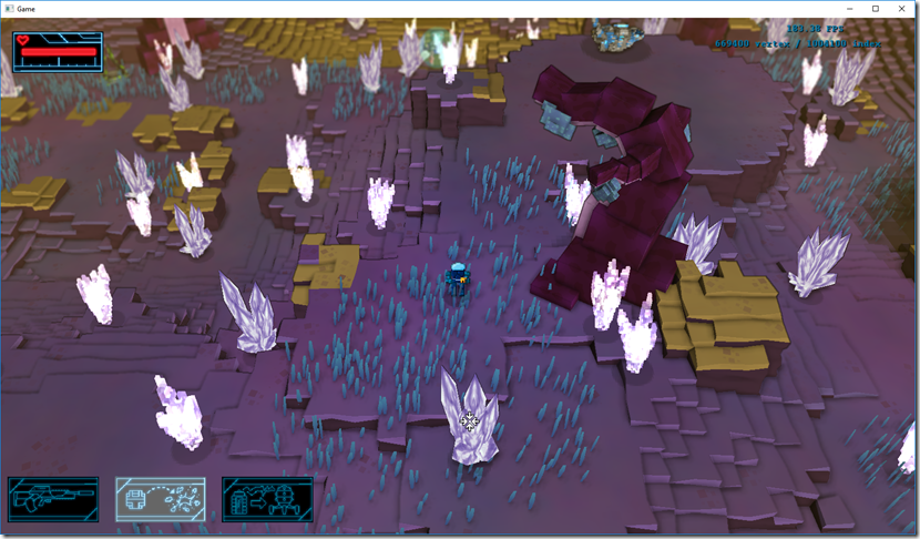
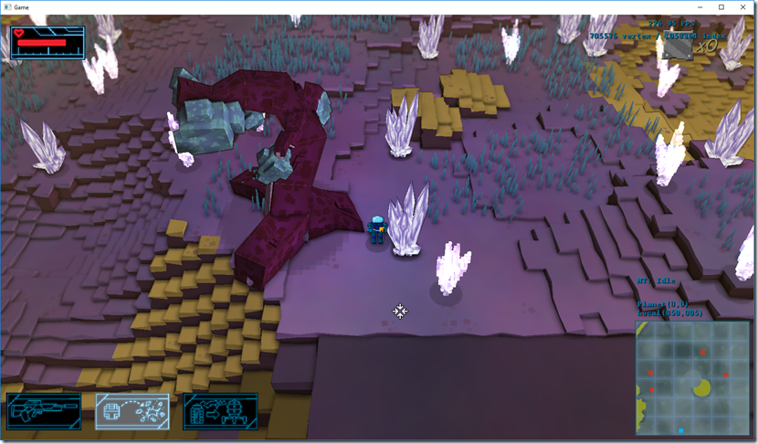
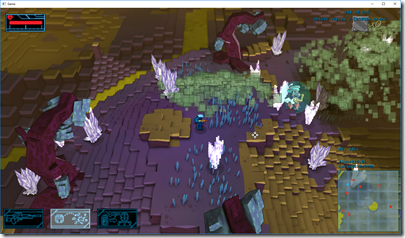
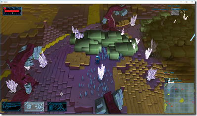
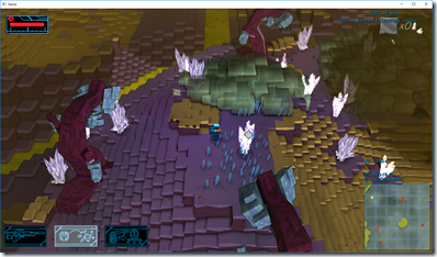
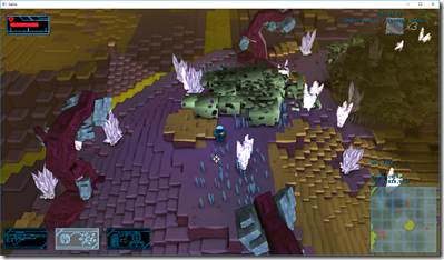
While work continued in trying to find “THE” tree, I’ve moved on to the river flow (which had a lot of fail cases), and trying to work on the acid cloud effect. This is the starting point:
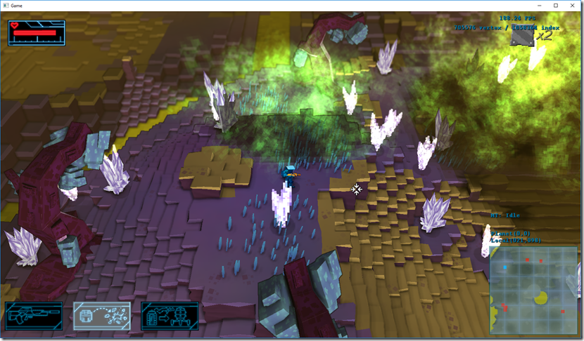
From here, I ran two separate experiments: using untextured quads, and using cubes as a basis. The quads experiment went rather well:
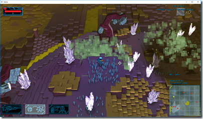
The cube experiments didn’t go so well… It doesn’t look like gas, but at the same time, I think there’s something there that can be explored further:
So, where we are now?
I think we got the terrain, water flow and small vegetation right, but we’re having a big argument if to go with the cube-based trees or the low-poly ones. This will influence the style of everything else, so it’s rather important we get it right. The cube tree has more personality in my opinion, but it might be hard making the game character in that fashion, while the low-poly is cheaper to produce/render, and may help to the readability of the game…
Regarding the acid cloud, I still feel there’s something to be done about the cube-fog, but currently I don’t have many ideas… Maybe something will hit me during the weekend! ![]()
I have a video of it in movement (and the water flow system as well):
The quality is not very good, but it’s enough to have a general idea…
Comment
You must be logged in to post a comment.