Work on art direction
So lately we’ve been using our (little) free time to work on some ideas for Gateway’s new art direction, and although nothing is finalized yet, we’re starting to have some ideas on where we want to take this.
We decided to start with the alien biome, since it’s the more… well, alien, and we think it’s a good way to start the work.
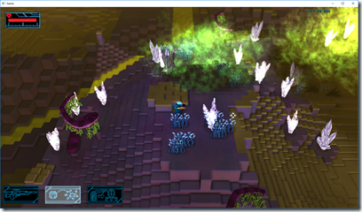
So, this is the current look to the game:
There are several big problems there: the color palette is too chaotic, you can’t really tell the difference between high places and low places (for example, check that part behind the ship, it has a drop there you can’t really see), the art styles are inconsistent (low poly models on the crystals and ship, sprites on the enemies and player, voxels for the terrain), and terrible color palette (for example, check the image above at 160 pixels width):
The yellows take over the scene completely, which is silly for an non-interactive object.
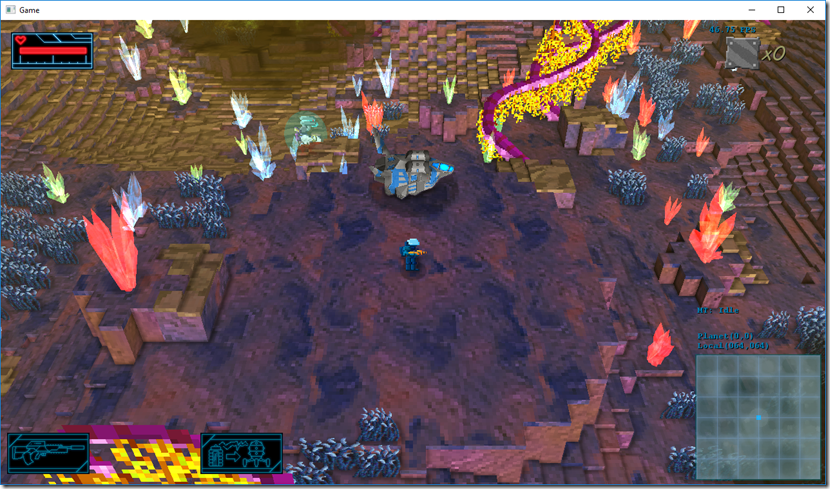
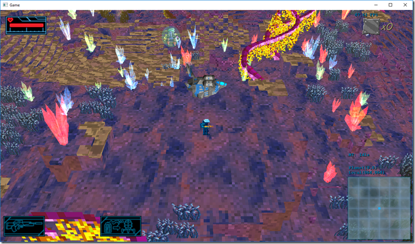
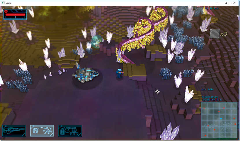
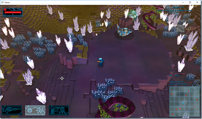
So, we started by playing around with the terrain shader to get a more consistent look, starting by aligning the texture to a voxel grid… We imagined at 25cm x 25cm x 25cm voxel size (currently it’s set to 1m x 25cm x 1m). This way, every single voxel has a single color. The results looked better in terms of less image noise:
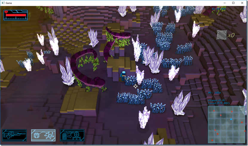
There’s no ambient occlusion is that image, by the way. We then played with the voxel size a bit more and with the texture itself, lowering contrast, number of colors and saturation in general:
First image has no ambient occlusion, the second does… And we feel this looks way better, even if the texture still needs loads of work.
After a bit more texture tweaks, we decided to try changing the crystals and ship for voxel version of themselves, using Qubicle’s automatic tools to do the conversion, but we’re not happy with the result. To have any decent results, we have to use a small voxel size, which adds to the image noise, and we’re trying to go the other way. We also added a depth of field effect, and the results there were quite good, it really gives a bit more depth to the scene.
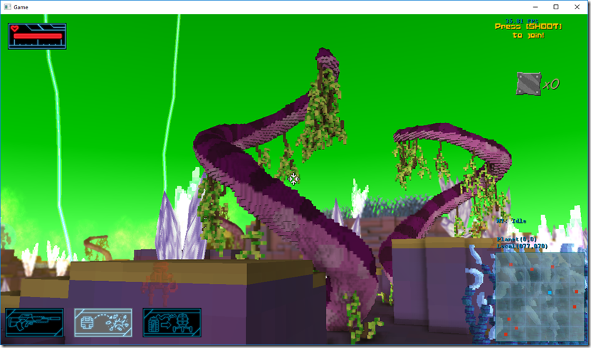
So I thought maybe the problem was the automatic conversion of model to voxel, so I asked the artist to convert the alien tree to voxels… After some problems with the 3ds importer I coded, we got the model in the game… And the results were completely underwhelming…
As I expected, to have any decent detail, the voxels have to be very small, which look good in some positions, but in most it just looks noisy…
So we kind of abandoned the idea of using voxel models, and we’re looking for other options (probably low-poly models, which will require some work to get coherent with the voxel terrain).
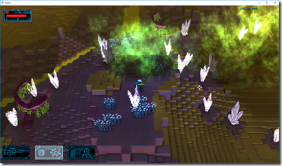
While thinking on solutions, we decided to do a small detour and work on the acid cloud effect, try to make it more coherent with everything:
Just pixelated everything a bit, really… Still not good, but we have some ideas (that require a lot of coding) we want to try out (namely a particle system that uses cubes instead of billboards).
At this point, we only had two things that we were happy about: the terrain tweaks (the color-per-voxel part of it) and the depth of field effect. And we weren’t any closer to finding an art identity for the game, that would lead to the rest of the visual overhaul.
I then had an idea (in the car drive to work): what about if I added some noise to the terrain vertices, trying to break the rigidness of the voxels, while keeping it in plain view?
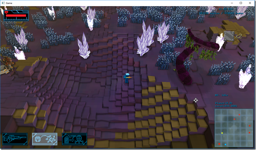
We changed the terrain shader to accommodate this, and voilá:
Suddenly, we’re happy! Although it still needs a lot of work, it shows us a possible path to the future visuals, using this kind of “distorted, boxy” feel to it. Even the tree I was completely unhappy with looks a tad better in this context:
Next step is we’re going to take this baseline and work on it some more, try to replace all 3d objects by low-poly models that work nicely with this type of terrain and see where that take us!
A long way to go, but at least we’ve found the entrance, we think!

Comment
You must be logged in to post a comment.