Grass
Working on grass for the alien planet… Results are absolutely terrible!
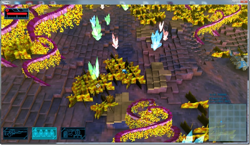
First I tried putting in grass in a triangular pattern, so you could look at it from any angle (for cutscenes, mainly)…
The first problem shows up… The normal of one or two prongs will always be extra dark, which will cause the ugliness above…
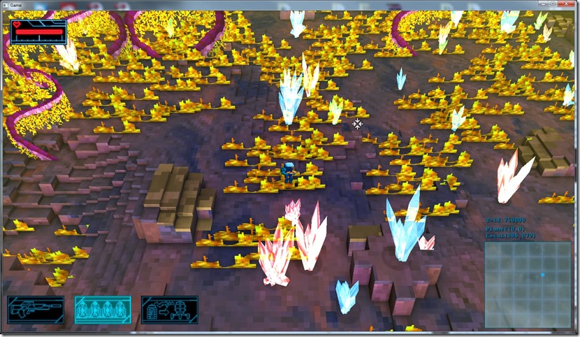
So, moving on, I tried just using a quad aligned XY plane:
Bleargh! I can even animate the vertex, that won’t make a difference, that’s absolutely terrible!
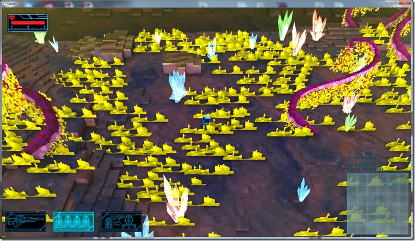
Tried playing around with the texture, results were even worse:
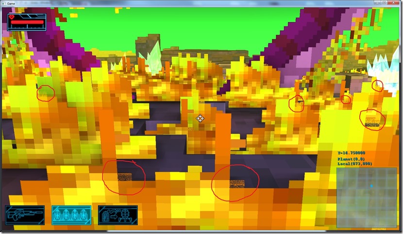
And to add injury to insult, there’s a small issue that I can’t track down:
If you look at the marked places, it seems to be some UV issue, or interpolation issue, but I have no idea where that comes from… It’s always in the position in the texture, but I’ve looked and looked and looked at the texture and there’s nothing there that can explain that…
So currently, the grass is a bust… The problem might be primarily with the texture, so I’m going to look into that, but maybe the type of perspective the game uses doesn’t work with grass…
Now listening to “Powerhouse” by “Mustasch”


Comment
You must be logged in to post a comment.