A bit disappointed…
…with the results of the ambient occlusion in practice…
It works fine now, but it’s extremely difficult to notice, which makes this whole endeavor kind of pointless…
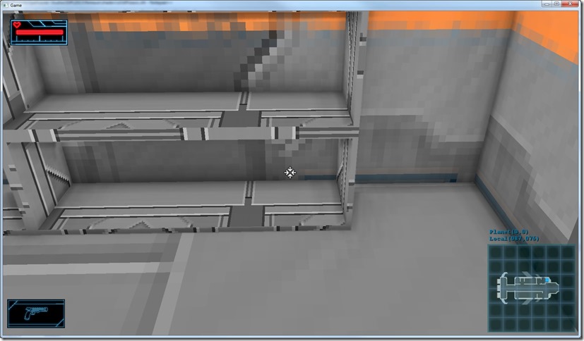
The effect is clearly there (note the corners and the far edges of the shelves), but it doesn’t help much with the whole lack of contrast I wanted to address with this…
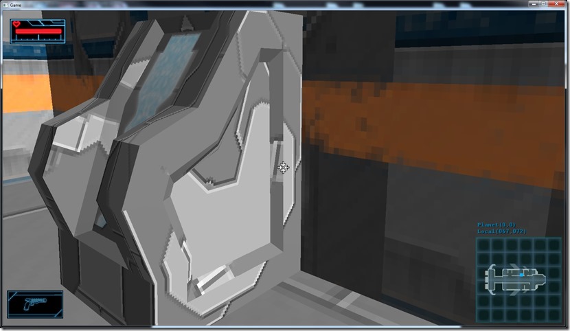
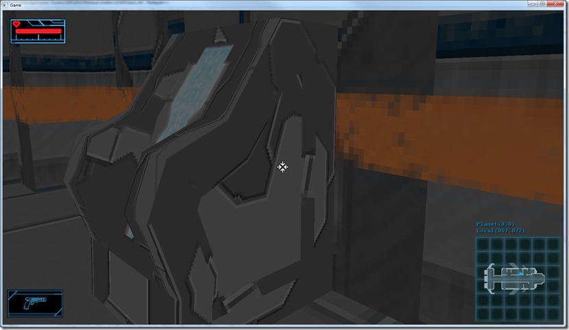
Below you can see the same scene without and with ambient occlusion:
Almost identical…
The problem is that due to the graphic style we’ve chosen for the game, there’s not much “ambient light” going around, it’s mostly direct lighting from light sources, which is unaffected by the ambient occlusion…
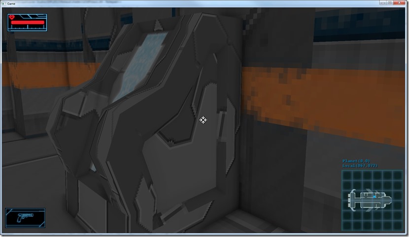
I could tweak this so that I use more ambient light and less directional light (on the space ship that might work very nicely anyway, and I might do it anyway, but even so it doesn’t have as much impact as I’d like)… In the screenshots below it’s the same comparison, but without any direct light:
I can also improve the filtering (I think I’m blurring too much, using a 4×4 box filter), or some kind of sigma curve to make the darker areas darker, or even modulate the direct lighting with the ambient occlusion, but in truth, I think the main problem is that the art isn’t done to work with this… Just a theory, but I think that for ambient occlusion to work nicely, you have to have stuff with more geometric surface detail, or normal maps…
Anyway, tomorrow I’m going to do a couple of experiments with this, see if I can reach some useful conclusion, but for now I’m convinced I’m going to have to implement actual shadow-mapping (only for directional and spot lights, which makes it way easier).
Now listening to “The Revenge” by “Allen-Lande”
Link of the Day: Some amazing screenshots from PC games… Some of them are processed or tweaked renderers, but still very impressive: http://www.neogaf.com/forum/showthread.php?t=963160


Comment
You must be logged in to post a comment.