Bad screenshot, no cookie!
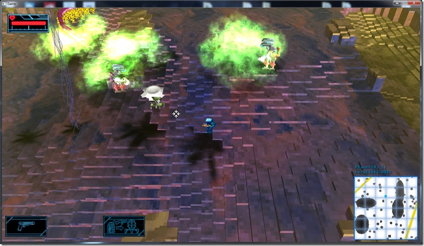
This is one of those screenshots that really demotivates me:
I was putting in the new spawner model for the robots, and after a big fight because I forgot a stupid flag, I got it in the game and took this screenshot…
The amount of things that are terrible in this is amazing:
-
The spawner has no textures (probably an exporting issue)
-
The lightning looks terrible (needs to be upgraded to the new lightning code I’ve done for the electro-cannon)
-
The lightning cloud is almost unperceivable when playing, except when it hits (and then it’s too late)… If I darken it’s shadow, it looks ghastly – solution, I need to add projective texturing for this (and some other places, I think)
-
The acid clouds don’t look very well, especially their shadow… You can’t see exactly when they’re going to hit you and kill you (so, needs a lot of work)
This is all “polish” phase work, but it really highlights I still have a long way to go, which annoys me…
Other than that, I just tinkered around with some writing and fixing other small bugs, including a crash when very specific circumstances arose…
Now listening to “Ashes” by “Two Steps From Hell”
Link of the Day: I’ve been skipping these because I’ve not been looking around the web that much… That said, how about a nice video that shows and teaches the melodic styles of 40 power-metal bands? If you’re not into guitar playing, just check out the first 4 mins or so… ![]()

Comment
You must be logged in to post a comment.